Your front door is one of the first things people notice about your home, and it sets the tone for what people expect when entering. While a fresh coat of paint can boost your property's appeal, expert interior designers have warned that choosing a "trendy" colour might do more harm than good.
Getting to the bottom of this phenomenon, Southern Living spoke to several interior designers about colour psychology and its impact on your home. Cathleen Gruver, the lead interior designer at Gruver Cooley Interiors, simply explained: "It's best to choose a colour that complements the surroundings and reflects your personal style without overwhelming the facade." Before you pick up a paintbrush for a trendy look, here's why you should steer clear of these eight colours.
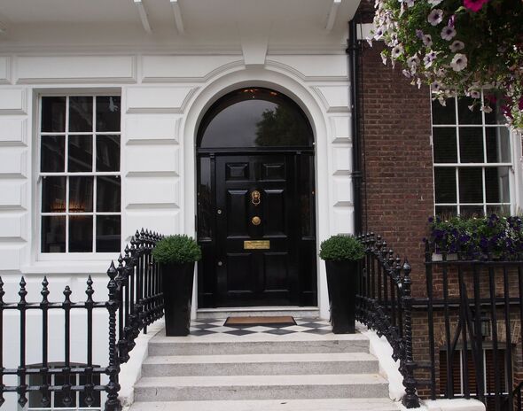
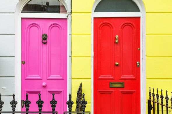
1. Dark blues and black
Homeowners should avoid darker hues such as dark blues and black, as these colours are more susceptible to damage in hot weather.
"These darker shades tend to absorb heat, causing the door to swell and shrink, which can lead to splits, cracks, or warping," said Karen Germond, the founder of KMG Design Studio in Charleston.
The expert also highlights that the doors will become hot to the touch, making them unwelcoming and harmful in the summer.
2. White
A white door requires a lot of maintenance and ends up looking dirty very quickly.
Lauren Connor, the founder of Lauren Connor Interiors, shared: "White because it easily gets dirty from heavy use, pets, or traffic pollution. And, it can appear plain, which misses a major statement-making opportunity."
3. Greys
Despite being a trendy colour for homes, cool greys look better inside homes rather than for the exterior.
Experts warn that grey doors can "feel aloof or out of sync with warmer architectural elements like brick, wood, or natural stone," explains Christopher Boutlier, the founder of Christopher Boutlier Interiors.
4. Browns
Having a brown door isn't all bad, but it is important to choose the right shade. Muddy browns can look dated or get lost against brick walls. Melanie Bryant, the founder of Melanie Bryant Interiors recommends richer browns or wood tones.
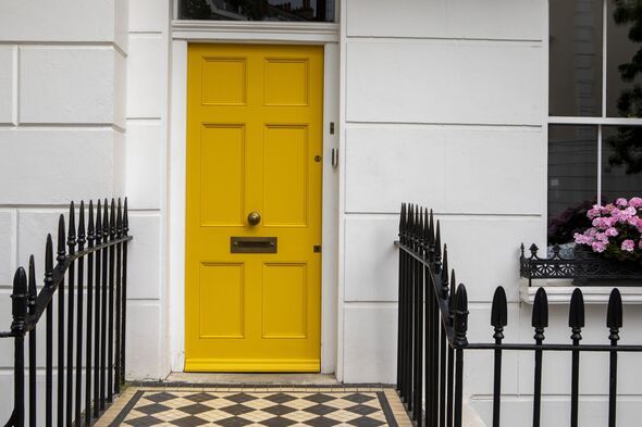
5. Yellow
A yellow front door is very hard to pull off and should be only used if you pick a deeper ochre tone or muddier mustard instead of a pastel or banana hue.
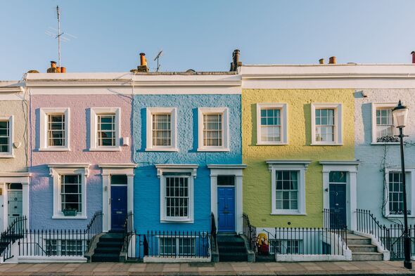
6. Pastel Tones
Speaking of pastel colours, experts warn that these colours simply lack visual appeal for your front door despite their warm and bright appearance.
Melanie Bryant said: "It's not that these can never work, but that they often don't give an entrance the visual weight it typically needs to feel like a focal point."
Another property expert, Christopher Boutlier, suggests steering clear of muddy pastels like lilac or mint green as "they can appear faded or underwhelming on a front door, particularly if the surrounding exterior materials are more traditional or richly toned."
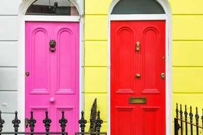
7. Super bright hues
Bright colours such as neon or overly saturated hues should also be avoided for your front door as they can fade quickly and "feel jarring and not welcoming," says Bryant. "Blue is the easiest colour to accidentally select too bright, I've seen this mistake made a few times!"
8. Anything Too Trendy
Trendy colours should be avoided as these colours are difficult to coordinate with changing seasons, landscaping, or even hardware finishes.
Your front door should feel timeless and complement the exterior palette, said Christopher Boutlier: "It's not about playing it safe, it's about making a choice that feels both personal and enduring."
-
Learn how today will be for you

-
Ishaan Khatter Aces Front Row Fashion In A Relaxed Glam Look At Louis Vuitton SS26 Show | Lifestyle News

-
Couple chooses last name in unusual way

-
The world’s most expensive food, 24 carat gold box is packed, does not let the old
-
iPad With MacOS? Apple Finally Answers Why iPads Will Never Become Like A Mac | Tech News